

They Arrived and Left in Two Seconds
I was sitting in a crowded cafe last Tuesday, trying to check a client’s link on a patchy 3G connection, when I realized I’d been staring at a white screen for twelve seconds. I didn’t care about the brand’s “aesthetic” or their clever copywriting; I just wanted the page to exist. Most people think reducing bounce rates requires a massive budget or some complex psychological trick, but they’re wrong. If you want to know how to reduce bounce on a bio page, you don’t need a guru; you need to stop treating your landing page like a digital scrapbook and start treating it like a functional tool.
I’m not here to sell you on “growth-hacking” or any other nonsense that sounds good in a LinkedIn headline. Instead, I’m going to give you the practical, slightly boring truth about what actually keeps people from hitting the back button. We’re going to look at load speeds, link reliability, and clarity—the three things that actually move the needle. No fluff, no expensive plugins, just the technical and structural fixes that ensure when someone clicks your link, they actually stay.
Table of Contents
Reducing Page Load Time for Mobile Users
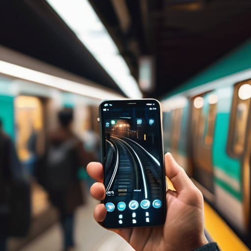
Most people build their bio pages on a high-speed office Wi-Fi connection, so they don’t realize that half their audience is trying to view the page while walking through a subway station or standing in a crowded cafe. If your page takes more than three seconds to load, you’ve already lost them. When I’m auditing accounts, the first thing I look at isn’t the color palette; it’s the file size of your hero image. Stop uploading 5MB uncompressed JPEGs straight from your camera. By reducing page load time for mobile users through simple image compression and lazy loading, you stop the immediate exit before it even happens.
It isn’t just about the images, though. It’s about the technical weight of the page. Every heavy third-party widget or unnecessary animation script you add is a direct tax on your visitor’s patience. I’ve seen countless creators try to optimize landing page conversion rate by adding complex interactive elements, only to find that those very elements are what’s killing their stats. Keep your code lean. If a script doesn’t serve a direct purpose for the user’s journey, delete it. A fast, lightweight page might feel “boring” compared to a flashy one, but a boring page that actually loads will always outperform a beautiful one that stays stuck on a white screen.
Content Alignment and User Intent Over Fluff

The biggest mistake I see isn’t a lack of content; it’s a lack of focus. People treat their bio pages like a digital scrapbook, filling them with every achievement, hobby, and side project they’ve ever had. But if a user clicks a link in your Instagram bio because they want your consulting services, and the first thing they see is a paragraph about your love for sourdough baking, they are going to leave. This is where content alignment and user intent become your best friends. You have to match the promise of your social media profile with the reality of the landing page. If the transition feels jarring, you’ve already lost them.
Stop trying to be everything to everyone. Instead, focus on optimizing landing page conversion rate by being incredibly specific about what you offer right now. Every sentence should serve the singular goal that brought the visitor there in the first place. If your bio says “I help small brands scale,” your page shouldn’t start with a generic “Welcome to my website.” It should start with the solution you provide. When you cut the fluff and align your message with why they clicked, you aren’t just being brief—you’re being respectful of their time.
The Three Mistakes That Kill Your Conversion Rate
- Fix your “Link in Bio” destination immediately. I’ve lost count of how many times I’ve clicked a profile link only to land on a generic homepage or, even worse, a 404 error. If your link doesn’t go exactly where you promised it would, the user is gone in under two seconds.
- Stop the “mystery meat” navigation. Don’t make people hunt for your contact info or your shop link. If I have to scroll three times to find out how to actually buy what you’re selling, you’ve already lost the sale.
- Kill the auto-play video. I don’t care how much you spent on that high-production reel; if it starts blasting audio the moment my page loads, I am hitting the back button. It’s intrusive, it’s annoying, and it’s a massive drain on data.
- Test your buttons on an actual phone, not just a desktop. A button that looks great on my MacBook might be a tiny, unclickable sliver on an iPhone SE. If a user can’t tap your call-to-action with a thumb, your bounce rate will reflect that frustration.
- Audit your social proof. If you’re using massive, high-res testimonial images that take forever to render, you’re sabotaging yourself. Use text or optimized, lightweight graphics instead; credibility shouldn’t come at the cost of performance.
The Three Non-Negotiables
If your value proposition isn’t readable in under three seconds, you’ve already lost them; stop hiding what you actually do behind clever metaphors.
Test your links on a low-signal connection, because a broken button is the fastest way to turn a curious click into a bounce.
Strip away the heavy animations and high-res hero images that serve no purpose other than to bloat your load time and frustrate mobile users.
Stop Overthinking and Start Testing
At the end of the day, reducing your bounce rate isn’t about finding a magic growth hack or a new design trend; it’s about respecting your visitor’s time. We’ve talked about the heavy lifting: optimizing your images so they don’t choke a mobile connection, and stripping away the fluff so your value proposition hits them before they have a chance to scroll away. If your page takes five seconds to load or asks them to solve a riddle to figure out what you actually do, you’ve already lost them. Stick to the basics: speed, clarity, and a single, functional path forward.
I know it feels counterintuitive to strip away the “pretty” elements you spent hours picking out, but a beautiful page that nobody stays to read is just a digital paperweight. My advice? Go back to your analytics, find the moment people are dropping off, and fix that one specific friction point. You don’t need a total redesign; you just need a page that actually works under real-world conditions. Stop decorating and start building something that delivers.
Frequently Asked Questions
How do I figure out if my bounce rate is actually high, or if people are just clicking my link and leaving satisfied?
You need to look at your “Time on Page” alongside that bounce rate. If someone lands on your bio, reads your three sentences, clicks your link, and leaves within ten seconds, they didn’t “bounce”—they converted. That’s a successful visit. But if they land and vanish in two seconds without a single scroll or click, you’ve got a problem. Check your exit pages; if they’re leaving because they found exactly what they needed, celebrate. If they’re leaving because the page is blank, fix it.
If I strip away the "decoration" to make the page faster, how do I keep it from looking like a boring, amateur text file?
You don’t need heavy assets to create visual hierarchy. I’ve seen pages that load in under a second that still look premium because they use white space like a professional tool. Focus on typography: use a bold, clear heading for your value prop and generous line spacing so the text can breathe. If you use a single, well-optimized SVG icon or a high-quality, compressed headshot, you’ve done enough. Structure is what creates authority, not clutter.
What’s the best way to test if my link is actually working for people on different devices without clicking it myself a hundred times?
Stop clicking it yourself; you’ll just end up with cached results that don’t reflect reality. Use a tool like BrowserStack or LambdaTest to see how that link actually behaves on an actual iPhone or a budget Android device. If you want a free, quick fix, open your link in a private/incognito window on your phone using cellular data, not your office Wi-Fi. If it fails on three bars of signal, your users are gone.
Should I be prioritizing a single clear call-to-action, or is it okay to have two or three if they are genuinely different services?
If those services are truly distinct, you can have two. But the moment you add a third, you’ve lost them. I’ve seen bio pages turn into a cluttered menu of “everything I do,” and that’s where the bounce happens. People don’t want to choose; they want to be led. Pick your most important goal. If you must offer a second option, make sure it’s visually secondary so the main one still does the heavy lifting.